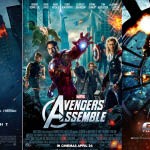
What do these movie posters have in common? Do you see the common colors? Have you ever noticed how often oranges and blues show up in movies, trailers and posters?
About a year ago, a Stanford University masters student by the name of Edmund Helmer posted a very interesting examination of the use of color theory in movie trailers on his blog Box Office Quant: Statistics and Film. Through his research, he determined that oranges and blues were the most prevalent colors used in movie trailers.
A synopsis of Helmer’s research
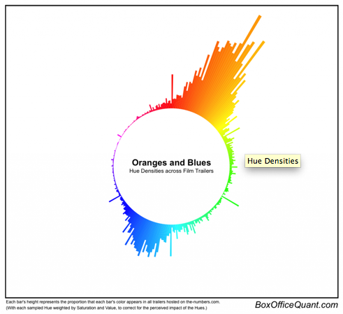
 What started out as part of a class project, Helmer downloaded 312 randomly selected movie trailers from The Numbers, a movie business data site. He was able to sample the frames for each individual movie trailer and extract its hue, saturation and value. (Since some movie trailers were longer than others, he weighted each pixel by the length of the trailer.) From his research, he was able to produce the chart at left; clearly showing that oranges and blues were the most prevalent colors used in the 312 movie trailers in his sample. If you would like to learn more about Helmer’s research process, you can read about it on his blog.
While we cannot verify that Helmer’s research on the colors used in movie trailers was the first of its kind, we do know that others have written blog posts about the (over)use of oranges and blues in movie posters and movies themselves over the years. But while these bloggers can give us many examples of oranges and blues in movie paraphernalia, they haven’t provided us with such a telling visual chart as Helmer did a year ago.
So what’s with the oranges and blues in movies?
Many movie bloggers and enthusiasts have examined the oranges and blues in movies and movie paraphernalia. They have associated this common color usage to action and adventure movies. As the writer of the Daily Slandered blog explained in 2012:
Generally, the oranges are used to highlight explosions, bright skies and boost skin tones towards the hyper-real end whilst the contrasting blues (opposite orange on the colour wheel) exaggerate stormy skies/seas and help create mood and tension.
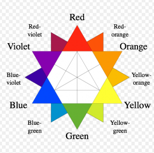
 While this relationship between oranges and blues with action and adventure movies exists, we believe there is more going on here. The Daily Slandered blogger hits on it – but doesn’t completely explore the concept – by inserting the parenthetical that blue is opposite orange on the color wheel, such as the one in the image at left.
Orange and blue being opposite on the color wheel make them complementary colors. These colors produce the strongest contrast while at the same time reinforcing each other; especially in graphic design. When put together, opposite or complementary colors can make each other “pop” and create opposite and conflicting emotions when viewed together.
So why are oranges and blues used more in movies instead of other complementary colors such as violets and yellows? Complementary colors can also reflect opposite concepts. In the case of orange and blue, the most common contrast is fire and ice; which can also easily relate to conflicts in action and adventure movies. Other opposing concepts that could be associated with oranges and blues are land and sea or natural and scientific. These are also great contrasts for action and adventure movies.
So are the oranges and blues in movies just a fad?
We haven’t been able to track down a graphic designer who works primarily on movie posters or a director who will admit to tweaking the stage lights just right so as to reflect the powerful contrast of oranges and blues on film. However, we are pretty confident after putting together the image below that whether or not complementary colors were understood in the early 1900s or now in 2014 that oranges and blues will continue to be used to portray sharp conflicts in action and adventure movies.


[…] […]