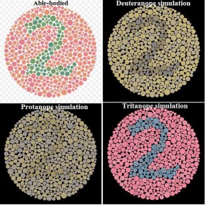
 On a recent flight, I sat next to a pediatric eye surgeon and we had an interesting conversation about the use of red and green in slide presentations. The surgeon’s contention is that since about 8 percent of the male population is color blind and almost all color blindness is red- and green-related, your key points should always be displayed in blue. She makes a great point because if you are in a male-dominated industry like printing that means you could be losing 5 or 10 percent of your audience every time you present.
Color blindness in the printing industry?
Yes, even in the printing industry based around color, we have plenty of folks who are color blind. Honestly, unless your job is setting color on press or evaluating that color at some point in the production process, being color blind does not exclude you from the industry.
Why is Facebook blue?
As I thought more about the surgeon’s argument, I realized it applies equally to the websites we design. Let me start this argument by letting you know Mark Zuckerberg, the founder of Facebook, is red-green color blind as reported in this New Yorker article.
Website calls to action: What color should they be?
Thinking about that quote, ask yourself if a call to action “buy now” button on your website should be red, green, or blue. Today, our “Start Free Trial” button on ProofPass.com is green, but soon it will be blue and we’ll collect some statistics to see if that improves our conversion rate.
Additional resources
I found this Color blindness article on Wikipedia helpful.
Also, this Wikipedia article on the Ishihara Color Test is great if you are wondering about your own color blindness (of course, see an eye doctor for a proper evaluation).
Here is more color blind information from WebMD.
And check out this very cool Vision Simulator (Warning: You may spend over an hour here like I did).
Finally, this post is intended to be a conversation starter, so please feel free to leave a comment below with your thoughts and opinions on this topic.