The challenge for the pre-press and printing side of our industry is to communicate the importance of accurate color specification to designers. The second part of the challenge is to provide enterprise wide tools that can be shared up and down the supply chain and make color communication easy and transparent.

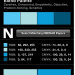
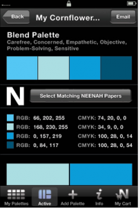
A short story – I often take for granted the amount of color knowledge I have at my fingertips. Granted most of my knowledge is technical or scientific and I am by no means a color scientist. I don’t have nearly enough physics or math background for that. On the other hand, I am lost when trying to pick color schemes for say a web-site. Fortunately, there are tools for that, like Think Ink from Neenah Paper. I use Think Ink when I need a palette for a web-site or a printed piece. Very cool app worth checking out.
Most designers probably struggle with the numeric and scientific aspects of color just as I struggle with the art of it. As technicians, we need to build tools like Think Ink on our side of the fence. If more tools like X-Rite’s ColorMunki existed perhaps pre-press and print shops would be getting better numeric specification of color from designers.
More designers and photographers would be working on calibrated monitors and outputting to calibrated printers. They might not be right up to ISO spec, depending upon the quality of the monitors and printers they choose to use. At least the monitors and printers would be as close as they could get and more importantly producing consistent and repeatable color.
Ambient lighting is often a problem in design agencies. Colors are picked and worked in one lighting condition. Then, they are printed in another (I would argue the correct one) and finally viewed in a store or office with yet another lighting condition.
There are many factors and variables to consider. What would be at the top of your list? What kind of software tools would you like to see of the design side of color?