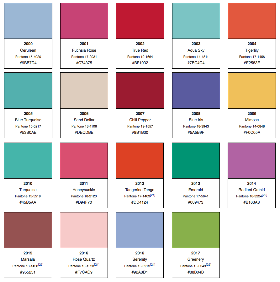
If you have been following our monthly Reading Lists, you know that the 2017 Color of the Year as determined by Pantone LLC is called Greenery. Each year since 2000, Pantone has determined and announced a Color of the Year (except in 2016, when the company named two: Rose Quartz and Serenity).
But what is the Color of the Year and how does it get chosen?
Pantone: The Authority on Color
 First, you have to understand something about Pantone. The company is a self-described authority on color that provides color systems and technology for the communication of color. It’s owned by X-Rite Inc., a company that manufactures and supports components of color technology.
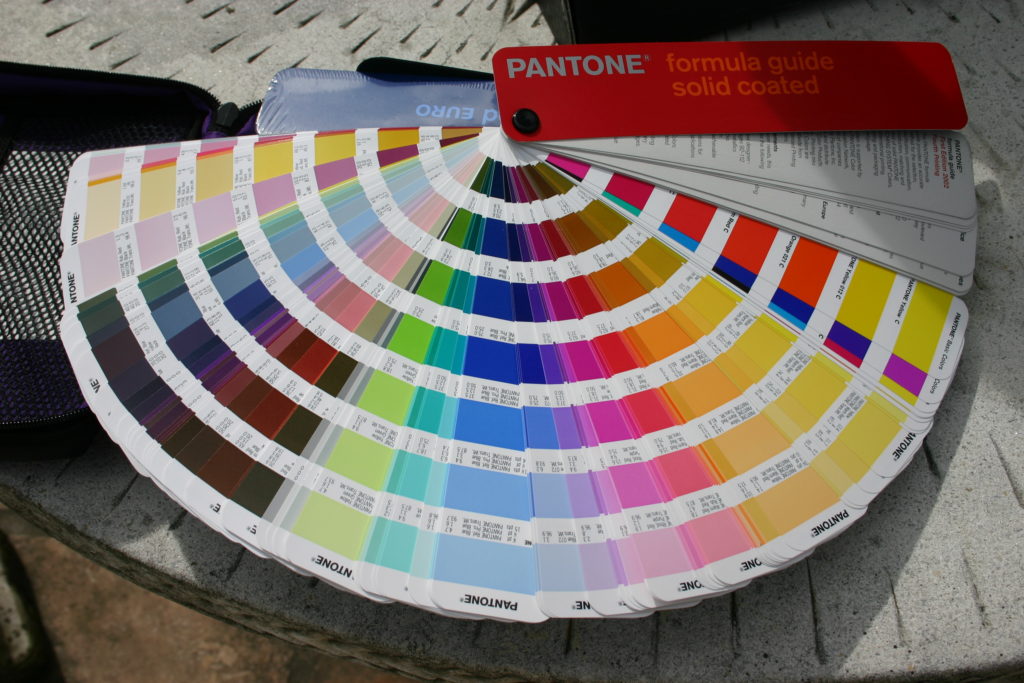
Pantone itself does more than determine the Color of the Year. They operate the Pantone Color Institute and distribute color forecasts and fashion reports. But perhaps the product they are most famous for is the Pantone Matching System; a book that fans out and is used to standardize color. There has been a lot of technological advancement in the printing and graphic design industry, but most serious printers and designers have one of these physical Pantone color books in their office and/or print facility.
So What About the Color of the Year?

According to the Pantone website, the Color of the Year is defined as such:
A symbolic color selection; a color snapshot of what we see taking place in our global culture that serves as an expression of a mood and an attitude.
But how do they determine the Color of the Year? They hold secret meetings in Europe twice a year and bring in experts in color standards groups from several different nations. After presenting and debating for a couple of days, the attendees settle on a color that they believe best represents the zeitgeist; which is the mood, ideals, beliefs and/or tone that motivates people during a certain period in time. The color chosen becomes the Color of the Year for the upcoming year.
Each time a Color of the Year is announced, the zeitgeist connection of the color is included in the press release. For instance, the experts believed 2011 was going to be a year of high stress for people. When they announced Honeysuckle as the Color of the Year for 2011, the press release stated:
In times of stress, we need something to lift our spirits. Honeysuckle is a captivating, stimulating color that gets the adrenaline going – perfect to ward off the blues.
In the case of the 2017 Color of the Year, Pantone said this about Greenery:
A refreshing and revitalizing shade, Greenery is symbolic of new beginnings.
Why is the Color of the Year Important?

Every year, Pantone’s designated Color of the Year influences many different industry decisions around the world.
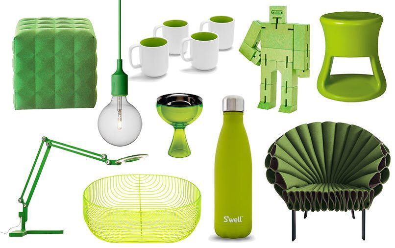
Designers everywhere strive to implement the Color of the Year into as many of their products as possible. This year, you’ll see Greenery popping up in signs, interior design, fashion design, flower arrangements, home and car color themes, and even restaurant plating designs.
If you’d like to find out more about Greenery as the 2017 Color of the Year, take a look at Pantone’s dedicated page. It even includes color pairings for Greenery.
Also if you want a little history lesson, Vogue just published an article “Pantone Through the Ages” and they walk you through each Color of the Year since 2000.
I wanted to share to my fb business page…it would be great if you made that option available!
Hi James,
As someone who worked for Pantone, I will argue that this decision is LARGELY the made by one person – Leatrice Eiseman, the executive director of the Pantone Color Institute.
https://www.nytimes.com/2016/12/08/fashion/color-of-the-year-2017-pantone-greenery.html
Thanks for the feedback Brenda. We have social buttons at the end of each post but not actual share buttons. It’s something we will look into. Meanwhile, if you would like to share the post, you could go to our FB page and share it from there: https://www.facebook.com/ColorMetrix/. Thanks again!
Hi Michael,
Thanks for your feedback. There is no doubt that the Pantone Color Institute is greatly involved with determining the Color of the Year. The interesting part to me was more of the way they analyze the current mood and tone of the world and choose a color to reflect that. Leatrice Eiseman is quoted as saying such in the NY Times article you shared. (Great share, by the way.) I do wonder how much the fashion industry is involved too.