 We had so much fun with our 18 Days of Color campaign during the national Social Madness contest in June that we decided to introduce a new feature on our blog: Color of the Month.
While working on the 18 Days of Color campaign, we did a great deal of research about how color evokes emotion. With our Color of the Month feature, we will take a close look at the world around us as well as the color and print industry to highlight a relevant color for that month. We also will research that color and provide an educational link or new color or print site in relation to the color to share with you.
If during the course of the run of this feature you have a color or relevant site or link to share that you’d like us to cover, please let us know.
The Color of the Month is … Burnt Grass
Since more than half of the U.S., where we are based, is or was in a drought this summer, we thought we would be whimsical by starting out with Burnt Grass as the first Color of the Month.
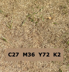
The image accompanying this post was taken from a backyard in the Milwaukee, Wis., area. As you can see from the image, there are many colors – from a light straw color to a more tannish brown – that could be considered Burnt Grass. We checked with Pantone, but they don’t list a specific color with that name; so more research was necessary to come up with a CMYK designation for Burnt Grass.
A community for colors, palettes, trends and more
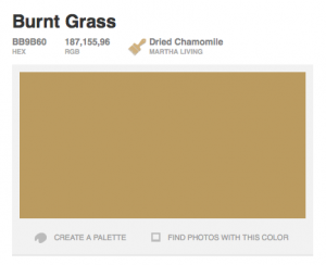
 We came across COLOURlovers, a community built to share ideas based on color. Within that community, we came across a color named Burnt Grass; which you can see from the image at left favors the more tannish brown color found in the image at the beginning of this blog post.
In COLOURlovers, you can search for a specific color name like we did. The colors available in the community are added and named by members. There are more than 5 million colors available. COLOURlovers also has search engines for patterns, palettes and shapes.
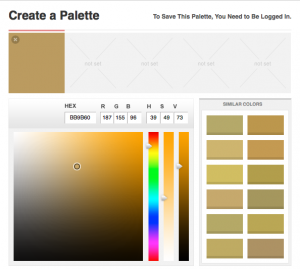
Once you find a color you’d like to use, you can view a palette of similar shades of that color by simply clicking on “Create a Palette” on the bottom left below the color swatch. You can add colors to your new palette or take COLOURlovers’ suggested matches.
 Another interesting feature of COLOURlovers is that you can find photos that include your chosen color (just click on the link at right below the swatch). This will open up an iStockPhoto window that will display photos and illustrations available for download that use that color.
In the limited time we spent exploring COLOURlovers, we can see that the community is a great tool for graphic designers. However, its business color trends for branding section on the site is also definitely worth a look. For fun, you can vote for or enter your suggestion for the Color of the Year for 2012 too.
While we may not use COLOURlovers consistently, it’s definitely a resource we’ve bookmarked for future research.
If you would like to suggest a color for our Color of the Month feature or would like to share a link or site related to color that we should explore, please don’t hesitate to contact us!
[…] August, we introduced our new feature of Color of the Month with Burnt Grass. Since much of the country experienced moderate to severe droughts this summer, we thought it was […]